DynaFont RareBook Fonts: DFRareBook-Magnolia

It is not difficult to make “white” different.
It is paler, like the calmness in life.
Lastly, we tailored this different style for it.
Ancient Book Font Series with Endless Stories
 Have you ever bought faience with broken corners from a pre-owned product market? They may be imperfect, but time has made them more attractive and captivating, with endless stories behind them. The Ancient Book Series represents the re-thinking of the unchanged technology products inspired by the idea of “re-packing the ancient”. The problem comes, can vector-fonts be inaccurate? In the absence of IT, ancient artisans could still make stunning carvings and movable types. Why can we turn imperfection into perfection?
DynaFont designers thus started a long research of various ancient books everywhere. Eventually, they found five collections of ancient books with elegant and delicately carved fonts from the reprinted versions published by the National Palace Museum and private publishers. These five collections are Thematic Essays from the Yuanfeng Era, Selected Poems of the Tang Dynasty, The Exploitation of the Works of Nature, Complete Library in Four Sections, and Selected Works of Bozi Fan. After six years of further research and remaking, five sets of fonts were developed in the Ancient Book Series and won the Good Design Award in Japan in 2014 for their profound historical value.
In search of the elegance of Song type from Juzhen FangSong
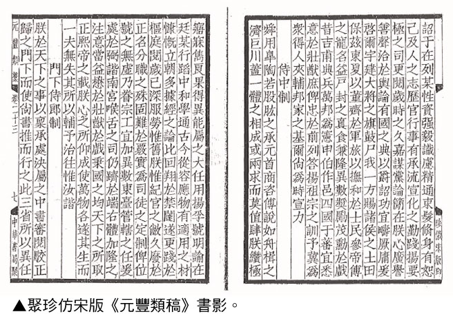 The DFRareBook-Magnolia font comes from the Thematic Essays from the Yuanfeng Era published in Juzgen FangSong type by Chunghwa Bookstore in the early 20th century. The FangSong type for printing this work is famous for being an intaglio using “Song” type to represent the comfortable, striking, refined and clean type style as found in books published in the Song dynasty. The type was made by the Ding brothers (Fu-zi Ding and Shan-zi Ding) during the late Qing dynasty and early democratic China. In view of the extreme formalism and vulgarism and the lack of ancient elegance of the lead types used on the market, they decided to make movable copper types based on the style of fonts used in a large amount of Song books they bought. Later, they established the Juzhen FangSong Printing House. Although it was acquired by Chunghwa Bookstore, the influence of Juzhen FangSong was spread by Chunghwa Bookstore, which printed a large number of ancient books with the type.
The Ding Brothers: Making Fonts We Use
Ding Shan Zhi was the project initiator. At the beginning, he just wanted to publish his father's works. As no types on the market interested him, he discussed with Ding Fu Zhi to make a type of themselves. Fu Zhi was a good calligrapher, good at seal carving, and an oracle maniac. If they were alive today, they would be crazy about the beauty of fonts. Thanks to their special preference to beauty, the Juzhen FangSong re-represented the charm of carvings of the Song dynasty.
*Highly Praised Song Type
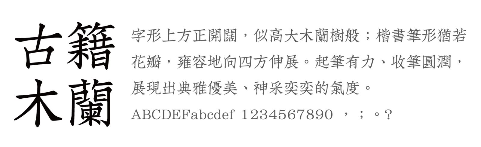
Features of DFRareBook-Magnolia
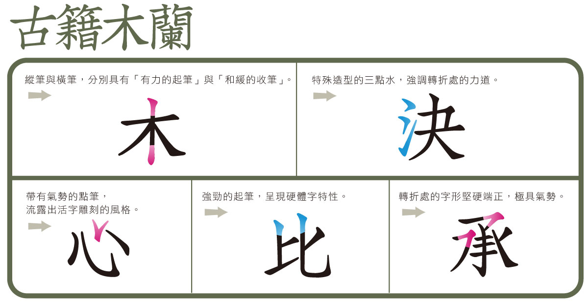
▼Examples of DFRareBook-Magnolia:
Usage
The DFRareBook-Magnolia font is great for books and magazines with characters printing horizontally and the contents intending to re-present the ancient type style. The font also fits for traditional craftworks and food packages for its classic elegance.
More Information