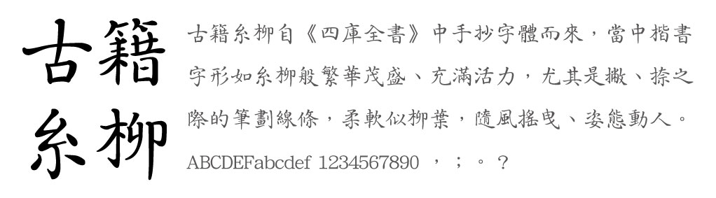
DynaFont RareBook Fonts: DFRareBook-Willow

With the call from the Emperor,
The souls that have slept for hundreds of thousands of years awaken…
Mounting on their horses from all corners of the earth,
Transcribing the glamour of the time when they built this empire.
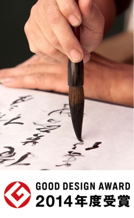
Ancient books style entering the Oscars of the eastern design award
 Let's start with the concept behind the Five Ancient Text Fonts. This series was inspired by the DynaFont designer's nostalgia for the “ancient” and the contemplation whether all designs born in the time of technology really is as exquisite as the advertisement claims. Is it possible to add some sense of culture in the digital world of 0s and 1s?
As we open the yellowed ancient texts, the characters and sentences all carry the weight of knowledge in an elegant manner. In a world before computers, literati document their talents and emotions with words, while craftsmen spread knowledge with engravings. All forms of communication were created through the warmth of the hands. The designers wish to apply the classic method and reproduce the image of ancient texts using the font technology of today.
The ancient text fonts are born from the limited edition ancient books from National Palace Museum and those collected from the common people. Five sets of books with beautiful, classic, and elegant texts were selected, namely the Siku Quanshu, Yuanfeng Leigao, Tang baijia Shixuan, Tiangong Kaiwu, and Fan Bozi Shiji. The DynaFont team spent six and conquered various difficulties, finally creating fonts that were rich in cultural depth. The font's perfect embodying of historical values through design won the Japan good Design Award in 2014, adding a classic and vintage style into the “Oscars of the eastern design world.”
The Story of the DFRareBook-Willow starts with The Qianlong Emperor
 The DFRareBook-Willow was developed on the foundation of Siku Quanshu, a collection of books compiled in the Qianlong court. The font of the texts in Siku Quanshu tells the tale of a lively age of literature. The Qianlong Emperor is a popular figure throughout Chinese history and has been depicted in many fictions and dramas. Qianlong Emperor is described as a charming romantic artist and a talented and well-read scholar.
Qianlong Emperor often pondered ways to make the glory of his kingdom known to others and figured “soft power” to be a good tactic, since it displayed the magnanimity of a large empire while also satisfying his love for art and literature. Therefore, in the year 1773, the Qianlong Emperor announced to collect books from across the empire, from which more than 3,000 valuable books were selected to be rearranged, collated, and transcribed in a standard format. The famous Ji Xiaolan was one of the chief editors. It took nearly a decade to finally complete the extensive collection of Siku Quanshu.
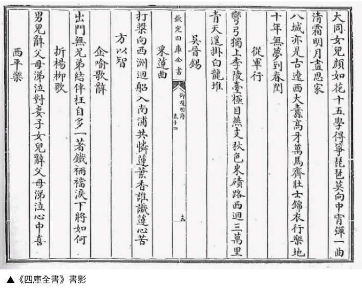 Siku Quanshu is a collection of more than 3,000 books, a masterpiece even in today's standard of digital prints. What's more, each word from the books is transcribed by hand. Since these were books that were to be read by the emperor, not only did the writing had to be neat and tidy, but also had to be consistent in style to guarantee smooth reading. This proved to be a difficult task. If all books were to be transcribed by one person, although the style of writing would be consistent, the working time would be difficult to evaluate. The problem lies in finding a way to work as a team while maintaining a consistent style.
※About Guangeti Calligraphy
Thousands of handwritings, each a challenge for the designer
 Looking back to when they were developing this set of fonts, the designers of DynaFont on the one hand, experienced the delicacy and elegance of the ancient calligraphy, catching a whiff of its refreshing quality, while on the other were agonizing on unifying the consistency of style of the texts that were transcribed by many. Compared to other ancient text fonts, which were troubled by the lack of characters, the DFRareBook-Willows had to be selected from a collection that is known to be composed of 800 million words.
Finally, with many years of experience and patience, the designers chose suitable fonts from the sea of texts, analyzing and picking brushstrokes one by one. With the help of modern technology, the Chinese characters of Siku Quanshu were transformed into modern font products that allow contemporaries a taste of the mellow aesthetics of ancient texts.
The characteristics of DFRareBook-Willow
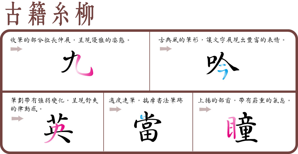
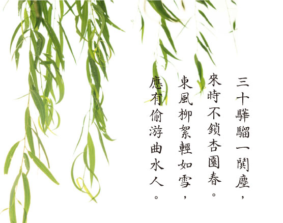
▼Example of DyanFont RareBook-Willow:
Usage
The swaying lines of DFRareBook-Willow make it suitable in texts that stress a handwritten style, such as collections of poems or articles. It can also be used in titles to express a classical image.
More Information