Category:Rare Books Series
2018/01/15
DynaFont RareBook Fonts: DFRareBook-Rosewood

The DFRareBook-Rosewood has a calm and stable quality,
Each word and sentence subtle and humble.
Reading becomes a leisurely experience with the annotation of the reassuring texts,
Settling in a solid manner on to the white paper,
Like the intertwining sandalwood in the tropical forest.
Come, join the font in storytelling, let your thoughts roam through the trees,
And take a short moment to relax!
Ancient books style entering the Oscars of the eastern design award
.jpg) This series was inspired by the DynaFont designer’s nostalgia towards the “ancient” and the contemplation whether all designs born in the time of technology really is as exquisite as the advertisement claims. Is it possible to add some sense of culture in the vector world of 0s and 1s?
This series was inspired by the DynaFont designer’s nostalgia towards the “ancient” and the contemplation whether all designs born in the time of technology really is as exquisite as the advertisement claims. Is it possible to add some sense of culture in the vector world of 0s and 1s?As we open the yellowed ancient texts, the characters and sentences all carry the weight of knowledge in an elegant manner. In a world before computers, literati document their talents and emotions with words, while craftsmen spread knowledge with engravings. All forms of communication were created through the warmth of the hands. The designers wish to apply the classic method and reproduce the image of ancient texts using the font technology of today.
The ancient text fonts are born from the limited edition ancient books from National Palace Museum and those collected from the common people. Five sets of books with beautiful, classic, and elegant texts were selected, namely the Siku Quanshu, Yuanfeng Leigao, Tang baijia Shixuan, Tiangong Kaiwu, and Fan Bozi Shiji. The DynaFont team spent six and conquered various difficulties, finally creating fonts that were rich in cultural depth. The font’s perfect embodying of historical values through design won the Japan good Design Award in 2014, adding a classic and vintage style into the “Oscars of the eastern design world.”
The Shiny black font gives the impression of sandalwood in a tropical forest
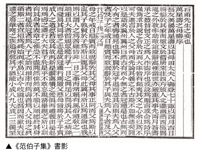
The design of DFRareBook-Rosewood was based on Fan Bozi Shiji (The Collected Poems of Fan Bozi) by renowned late-Qing dynasty scholar Fan Bozi and the edition proofread and engraved by Hsu of Che Si. When the designers first laid eyes on the text, they were deeply drawn to the classic impressions and its crisp black visual. These qualities remind viewers of sandalwood from the ancient tropical forests and its shiny surfaces polished by falling raindrops.
After years of nourishment from designers, DFRareBook-Rosewood finally appears on screen
 It takes at least decades for the sandalwood in the tropical forest to form. Likewise, the production of DFRareBook-Rosewood also requires time, even with the help of modern technology, the creative process of the font requires the skills of the designers added with the mellowing of time, a process that involve more difficulties than imagined.
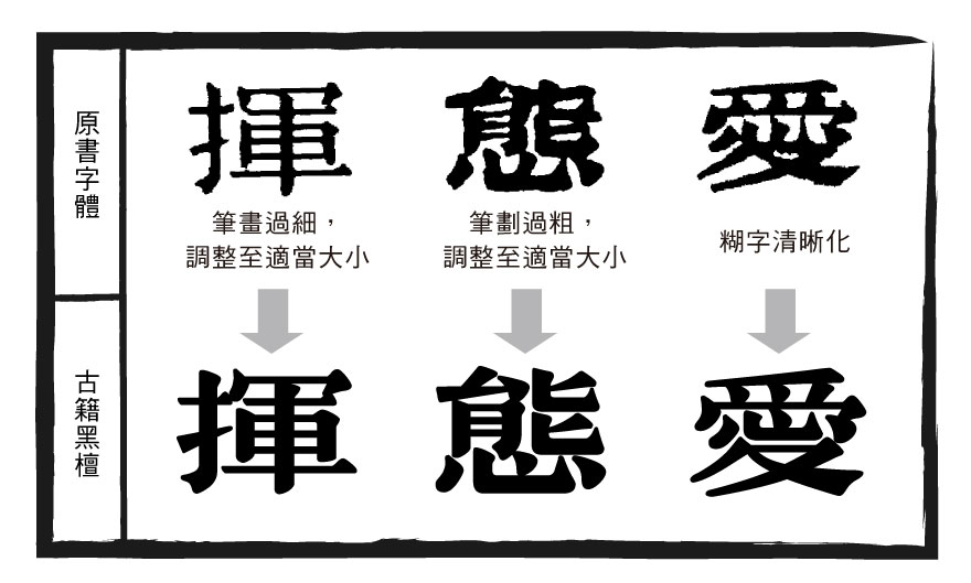
After the initial and detailed inspection of the texts in the original book, the designers discovered that the brushstrokes where filled with character, with firm curves and an enduring strength, while each brushstroke is crisp and clear-cut. Savoring the texts, the viewer can almost fathom the writer’s movements and pauses. However, like the difficulties that the designers faced when producing other fonts, there were obstacles such as inconsistent thickness in brushstrokes, the blurring of some characters, and writing methods that were different from today’s standards.
To conquer the obstacles, the designers unified the thickness of the horizontal strokes to achieve visual consistency. As for the un-unified writing methods and blurred characters, the designers followed the principle of “capturing the spirit,” which re-designs the brushstrokes while following the style of the original font. This is the reason why the Five Ancient Text Fonts took six years to complete.
The characteristics of DFRareBook-Rosewood
DFRareBook-Rosewood has a firm and stable style with a lower center of gravity, wide characters, and thick brushstrokes. The slants and right falling stroke give an unyielding sensation that resembles the traces of carving or polishing a sculpture. The font gives an overall reserved and classical quality.

▼Example of DFRareBook-Rosewood:

▼Example of DFRareBook-Rosewood:
Usage
 The thick and solid brushstrokes of DFRareBook-Rosewood makes it perfect for distinct titles on the front page of magazines and books. However, its subtle and humble quality also makes it a good choice for traditional food packaging. In addition, a slight change in the fonts may create lively and surprising effects for poster prints!
 More Information