Kids are dreamers with stunning and unlimited creativity.
We are born with innocence which gradually extinguishes
after we became worldly and conditioned as time goes by.
While innocence was part of us, why not finding it back?
Be light-hearted, read children books, and play with kids are quite good options.
Today, the font story introduces another “secret recipe”
for you to regain innocence through characters.
What was that? Check it out!
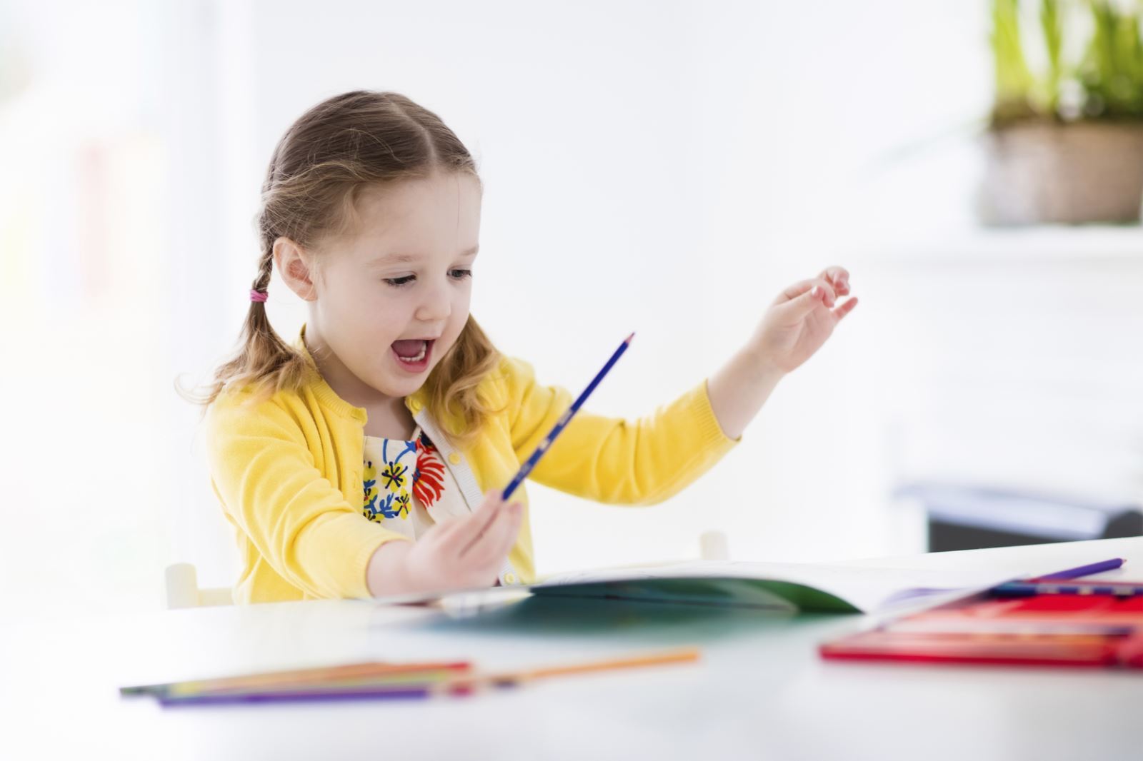
Kids that love to doodle are little artists
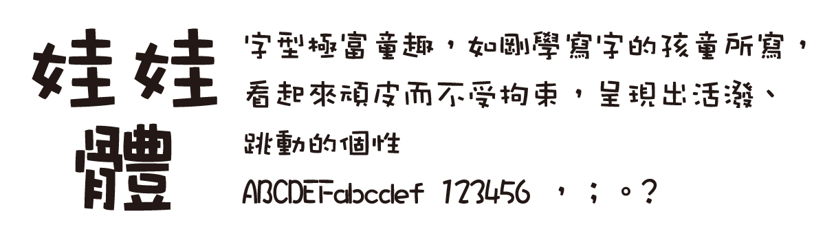
When asking a kid who starts learning writing to write down their name on a piece of paper, they will probably say: “Yes, I can.” Then, you will find lots of unidentified signs and symbols in that paper, which is annoying and amusing at the same time. This is the process for kids to learn writing. Although the doodles are made by kids with incomplete finger muscular development are not rigid in appearance and inconsistent in size, they are lovely and cute, thus inspiring the development of the WaWa (literally kid) font.
A new attempt subverting tradition with a thick and round style
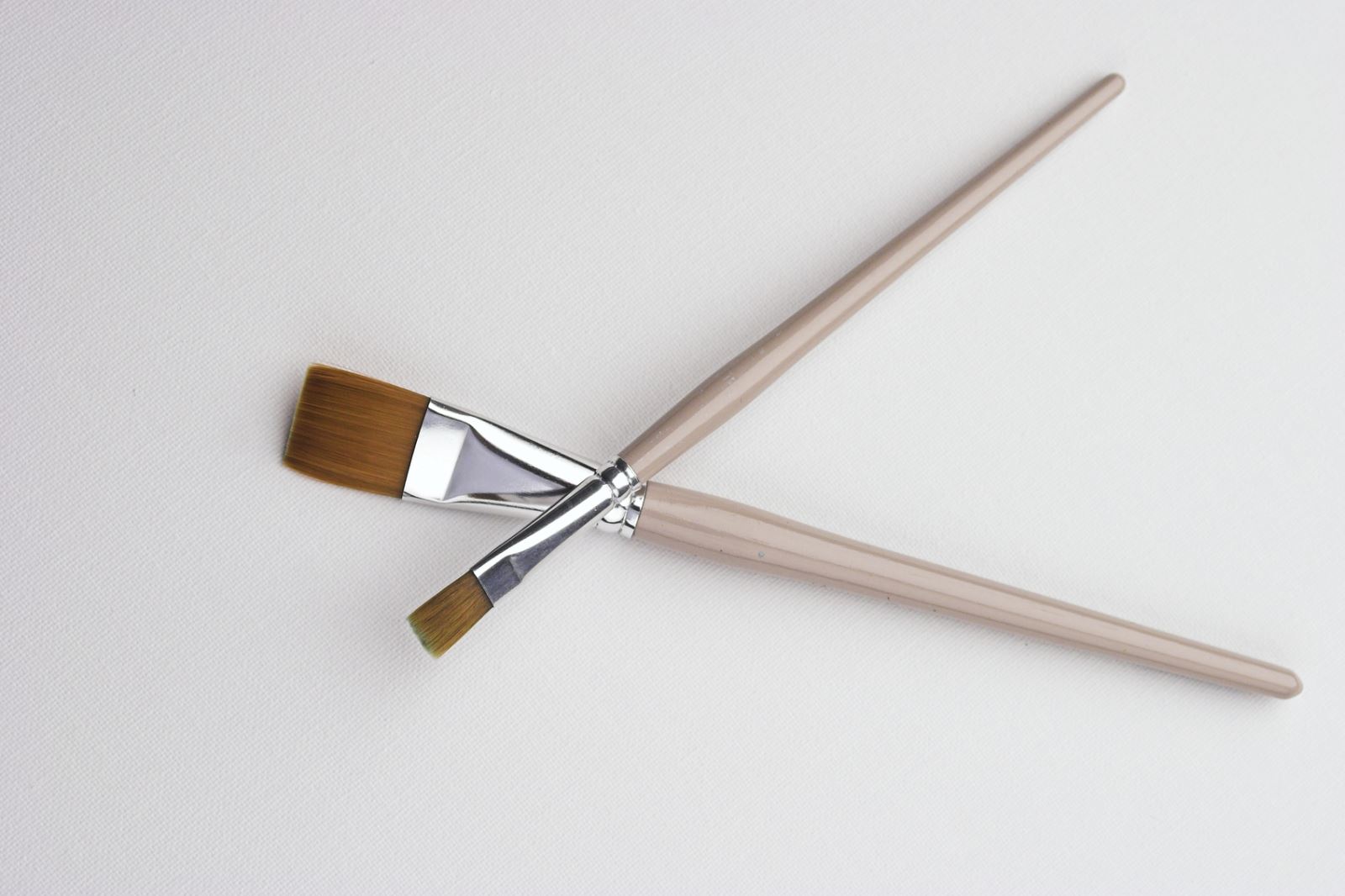
The unexpected and unanimous acclaim for the lovely girl font launched in 1993 has encouraged its designer to try another handwriting style font blended with vivid and rhythmic elements to revolutionize traditional font design. In this design, the designer used a flat brush and black poster paint for the first time. As the flat brush is soft, the designer deliberately used more paint and pressed the brush in the middle of a stroke to bring a thick and round feeling.
Naughty X Cute font comes again!
The font size varies to present a naughty and unrestrained appearance, looking like the characters written by kids (wawa) at the beginning of learning. It took the designer about two years (1994-1995) to launch the font. The font fits for use on titles of leaflets (flyers) for youth, children books, posters, and signboards.
Characteristics of DynaFont - WaWa font
This font has a cute and childish appearance featuring a significant proportional difference of radicals or side components or short, small, compact dots in place of normal stroking to present a vivid and rhythmic personality. The overall structure is tight and centered and a barrel-like shape is created on strokes with the characteristics of the flat brush.
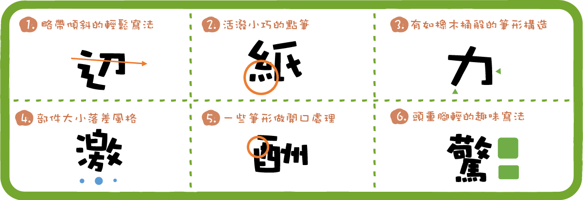
▼Examples of WaWa font:
Designer's insights
Q: What are the focuses of font alignment
D: Length, side components, or radicals should be presented through proportion differentiation without sacrificing the unitary feeling.
Q: What other attempts other than the flat brush have you tried?
D: Other designers and I have found some bamboo in the bamboo forest near the company. Then, we shaved the bamboo down to the form of a quill for the experiment.
Q: During times you felt annoyed or were stuck, how did you overcome work or emotional stress?
D: I listened to music or went to concerts!
Q: DF-WaWa has become a representative work of DynaFont and of the subject of much imitation. What is your opinion about that?
D: It's a pleasure! I appreciate DynaFont for giving me this opportunity and not kicking me out for designing such a free, unrestrained font.
Q: What other styles challenges do you wish to take up in the future?
D: Recently, I have joined the design team of Hei font. In the future, I want try some basic fonts in Song script again to see if there are opportunities for changing them.